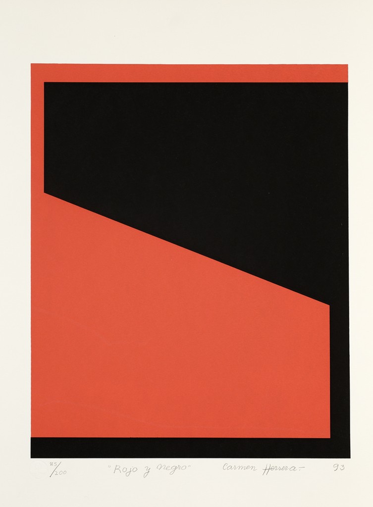
As an architecture major in my senior year, one of my main focuses currently is building a solid portfolio with compelling representations. I am trying to explore new ways of representing architectural drawings such as plans, elevations, sections, etc. In this exploration I found myself drawn to abstract, deconstructed, minimalist representations of the built environment, and compelling, dynamic, tensile, representation of lines, shapes, and planes. This description inevitably leads to the works of the likes of the Supremacists such as Malevich, Lissitzky, and most importantly, Zaha Hadid and her incredible paintings redefining space, form, movement, through composition and abstraction. Naturally, while scrolling through the Gallery’s artists and bumping into Carmen Herrera’s 1913 “Rojo y Negro”, my attention was instantly grabbed. Simple forms, two colors, interacting with each other, almost dancing, creating tension through a compelling composition. I immediately thought this is an architect’s work. These lines, shapes, planes could be -plans, my brain immediately goes, Malevich, Zaha Hadid, Mondrian: if a few lines were added on the corners, this would become a building. Surely enough, I looked up Carmen Herrera, she was trained as an architect, it was now clear, she was going to be the artist I was going to write about.
I will start by concentrating on her 1993 print, “Rojo y Negro”. It is 16.125 by 13 inches and is the print number 85 out of 200. It was purchased by Lehigh University in 2014 through the University’s Fine Arts Endowment. Some of the prints are still on sale, and the price ranges from a few thousand dollars to about ten thousand dollars. The description is simple, two interlocking or superimposed contrasting clean geometrical shapes. The title says it all, “Red and Black”, two red and black shapes, coexisting in a state of perpetual tension, like magnets simultaneously pulling and pushing each other away. The magnetism is here originating from the interplay between clean edges that are contrasting with the colors black and red, and an original composition. A composition that drags this tension from the middle of the print, where we have a diagonal violent schism, almost a fault caused by an earthquake that defines the work, we have here an opposition between two separate worlds that are inextricably linked. This could have been a simple statement, a rectangle cut by a diagonal creating two contrasting colored worlds. However, the twist comes, when she extends this schism to the upper left and lower right corners, creating a right-angled contrasting line at the top and bottom that both frames the design and suggests its extension, infinity, beyond the canvas. It is this twist in the composition that makes this print compelling and raises questions about design, form, structure, proper to an architectural quest for representation, form, and composition. The architectural quest of the Supremacists and their heir Zaha Hadid who through composition tries to redefine the built environment is here. It creates almost a brutalist kind of shape reminiscent of the architecture of the Blade Runner movies, especially the most recent one. As I said prior, to me, this print could be a plan, an elevation, or a section of a building, adding a few lines on the corners would immediately transform this design into a gracious, compelling building.
I will now dive into Carmen Herrera’s difficult and peculiar life and career, only gaining recognition in the United States in the 1990s and selling her first work in 2004 to the MoMA. Born May 30, 1915, in Havana, Cuba, she was the daughter of a cultured supportive family of Cuban, political activists, journalists. One of seven children, she started studying architecture in Havana, abandoning her studies when she married an American English teacher in 1939. She then leaves Havana saying that “There were always revolutions going on, and fighting in the streets. The university was closed most of the time, so it affected my studies.”. When asked about her difficult career as an unrecognized woman artist and the contradiction with studying architecture in the 1930s, she says that one of the good things about the Cuban regime was the absence of “Machismo” in terms of education. She then moved to New York with her husband where she studied art and art history at the Arts Students League. However, her most formative period was perhaps between 1948 and 1953 when she moved with her husband to post-war Paris. Where she started holding exhibits at the Salon des Réalités Nouvelles, where she was exposed to the work of Kazimir Malevich, and the early Russian supremacists, as well as Piet Mondrian and De Stijl artists, and the work of Robert and Sonia Delaunay. These encounters shed a light on her work with abstracted, simplified forms, as well as the interplay between color and its absence, composition, and architectural undertones, which explain my affinity for her work. In France, she was friends with the cultural rebel Elite, like herself. Amongst her friends, we could count the “enfant terrible” of French literature, the gay French writer Jean Genet, as well as the “enfants terrribles” of philosophy, the couple of Jean-Paul Sartre Simone de Beauvoir. After she left Paris, inspired by what she had seen, her style got even more simplified, she abandoned curves and started limiting her colors to the number of two per painting, pushing her abstraction of form and quest for compelling compositions even further, a process which she calls “purification”. As she said, “I never met a straight line I didn’t like” the abstraction was focused on exploring the relationship between straight lines (that could be squares of course as our own Jason Travers insists in his 2D foundation class!), composition, space, and the environment, oftentimes inviting it into the print, as seen in her Blanco y Verde series where the white of the canvas invites the environment to interact with her green lines. However, despite her innovative work, she has spent almost six decades unnoticed until her first exhibition in the United States in 1985. She started gaining more recognition in the 1990s and sold her first painting to the MoMA at 89 years old in 2004. By 2009 she started having European exposition and nowadays museums from the MoMA in the US to the Tate Modern in London are exhibiting her works. She is now 105 and still works on her designs daily. When asked why she thinks her work was ignored for so long, she says that it is because back then everything was controlled by men, and, moreover, her work was no watercolor domestic life depictions, it was abstraction, a violent expression, at the time considered unfit for Women.
This brings me to the following question, why, coming from similar conditions, doing similar work, did Carmen Herrera have a drastically different life and career from that of Zaha Hadid’s. Indeed, both of them were women, trained as architects, immigrants from third world countries (Irak and Cuba), and both of their works were influenced by the early European Avant-Garde and especially that of Kazimir Malevich. Moreover, Zaha Hadid never switched to art and evolved in the world of architecture. And if we thought that the realm of art was tough for women at the time, architecture was impenetrable. And yet the latter is nowadays recognized by the world as one of the major figures of her field, and has, after a few years of struggle attained worldwide acclaim and success, to the point where she now is simply known by her first name, Zaha. To my mind, there are two reasons. First, the difference in time. Carmen Herrera was born in 1915, through the first wave of feminism when women were still struggling for the right to vote in most countries, the questions of public and private equality of the sexes was not on the table at the time. Hadid was born in the 1950s with the second wave of feminism, where women started getting empowered both in the public and private realms. And on the other hand, while art was more accessible to women than architecture, it is a more lucrative field, a field worth millions, even hundreds of millions of dollars per project. Therefore, in the mid 1980’s when both of them started getting recognition, Zaha’s work was going to be a tad more lucrative than Herrera’s. That being said, it is very interesting to compare their pictural works and see how the early European avant-garde influenced these two remarkable women 4 decades apart. It is also interesting to think about the pictural works of artists with architectural training and the similarity between them, how instantly they can be recognized. We could take the example of our own Professor Anthony Viscardi and his shadow tracings, where again, we can instantly see the influence of constructivism, and this manipulation of space, planes, geometry, and composition.
Citations:
- Artstor. “Artstor.” library.artstor.org, https://library.artstor.org/. Accessed October 21st, 2020.
- “Carmen Herrera: Lines of Sight.” Carmen Herrera: Lines of Sight | Whitney Museum of American Art, https://whitney.org/exhibitions/carmenherrera. Accessed October 21st, 2020.
- “Carmen Herrera.” Lisson Gallery, https://www.lissongallery.com/artists/carmen-herrera. Accessed October 21st, 2020.
- “How Carmen Herrera Became One of Art History’s Most Celebrated Abstractionists.” ARTnews.com, https://www.artnews.com/art-news/artists/carmen-herrera-why-is-she-famous-1202688957/. Accessed October 21st, 2020.
- “Carmen Herrera” artnet, http://www.artnet.com/artists/carmen-herrera/. Accessed October 21st, 2020.
- Hattenstone, Simon. “Carmen Herrera: ‘Men controlled everything, not just art,’” The Guardian, https://www.theguardian.com/artanddesign/2016/dec/31/carmen-herrera-men-controlled-everything-art. Accessed October 21st, 2020.

Rojo y Negro, Carmen Herrera 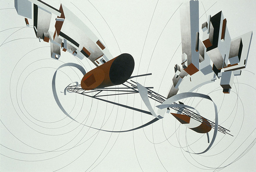
Tatlin Tower, Zaha Hadid